 This is the front cover from the book I made at Christmas time on Shutterfly for my in-laws. It is 12 inches square and 78 pages. (The package starts with something like 20 or 25 pages so you see I exceeded that.)
Please be advised that Shutterfly changes its prices at random and without notice. Finish your book well before you need it and shop the company's prices until you hit on a combination of prices (if you're doing multiple books) that works for you. Hind sight is 20/20.
First, why Shutterfly: I looked at about ten other sites that offer photobooks but this was the only site (and book format within that site) I could find at that time that offered a lot of text spaces (or journaling spaces). Most of the other books allowed just for photo captions.
By the way, I won't go into the harrowing experience it was trying to do this project justice in just two weeks' time and all the pitfalls, unforeseen catastrophes, and setbacks, nor the huge number of hours this took and how happy my family was when I finally sent it off and how supportive they were (behind the complaints) and how I think I was given by God stamina and mental clarity beyond my physical ability during those two weeks. Now where was I? Oh, yes.
Second, beware the text issues of this format. I could not cut and paste within the project--if I decided to move text (which unfortunately occurred OFTEN), I had to write it out long hand and retype it elsewhere. That was hellish. When I complained about this to Shutterfly, it claimed that it could be done but I was not able to get it to work despite my efforts AND I think they're lying or at least misguided.
I liked the general looks of the pre-set background pages--they were very nice looking--although working with the pre-set openings (for want of a better word) in which to insert pictures and that combined with pre-set phrases like "Passions" or "Challenges" really was limiting and difficult in the long run. They needed many more pages and combinations of openings and the ability to change the caption from "Passions" to "Fun Times" or something more fitting the photos.
 I chose to make the title page picture sepia tone but I selected to do all the other pictures inside the book black and white (but one) to unify the look of the book and to make it all seem "vintage."
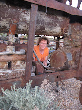
 Two warnings: Shutterfly does warn you if a picture isn't the right resolution for a particular spot (i.e., size) but that does not mean that the picture will really look wonderful. I would say that nearly all the pictures I was working with were snapshots and small pictures, often poor quality, but they were all the pictures existing from the past--not like today when we have really too many pictures to choose from. The book was 12x12, so many of the snapshots were being blown up far beyond their original size. I was both heartened that some of the pictures turned out MUCH better than I thought they would and disheartened that some pictures which seemed good turned out worse than I thought they would (the picture of the man, above, being a case in point and nearly the first picture you see when you open the book). Overall, I am OK with how the pictures turned out and feel they, mainly, turned out better than they should have given what I had to work with. But you could not REALLY tell from the computer screen exactly how the pictures would look in the finished book. My DH was disappointed with the quality of the photographs in nearly every instance.
There was also more to putting in the pictures than dragging and dropping them in a slot. You had to refine the size so it looked right in the opening. There were also other tricks I had to employ to get some photos to even work within the openings.
 Here is another sample of a layout. One note about text again. As I said, it was the most hellish part of the project. Just because Shutterfly has a small font size available, do not blindly rely on its presence there as an appropriate font size for your project. You need good bi-focals or a good magnifying glass to read many of the text sections of my book--I usually started out with a larger font but as I collected more and more history, I would add and add until the text was reduced to its smallest font. I would not "blindly" (pun intended) use the smallest font size in reliance that it will be a readable font. Hind sight is 20/20. However, on the upside, I believe most family books like this become photo albums after the first read (or they become door stops, or worse :-).
 I thought the pictures on this page were particularly cute and representative of many of the classic/vintage pictures and important family images that the book contained. The background pages were great and I might still be trying to decide how to arrange my own backgrounds if I'd chosen to create my own.
 Here is a sample of two of the ancestor pages I included. I searched out and included little nuggets of information about each individual. Some of the pictures I obtained from books or from the internet and some were pictures my in-laws had never seen before. That was pretty exciting for me. Ever since I married into the family, I have been actively collecting ancestors' pictures and so I had more than I actually included but ended up collecting new ones in the process. I ended up scanning about 200+ photographs, some multiple times to get them right, and some I had rescanned by professionals trying to get the best possible resolution. This project was scan-intensive. I don't think the book contains 200 photographs but I did scan more than that just during the two weeks I worked on the book.
 Here is the only colored photo (see inset at right) and the layout is a great sample of how text can be used in the book. One problem is the text did not "flow" from column to column--this was extremely problematic because you could not change things around without much difficulty. Despite this, I think it might have been simpler in the long run (assuming I would follow my own advice and have everything typed out in advance) to have used these pages more and just done little captions and maybe a story here or there on the other pages. But my text evolved--I'd rearrange and then have holes where I needed text so I'd call and get information. Invariably there were more new stories than could fit so I would then find a "home" for those bits (and so the font shrank), etc. Going in to the project, I had not intended to have as much text as I ended up with--text was to be incidental--but the project seemed to demand that it was done right, and so I ended up doing interviews with family members and many telephone calls to my in-laws to get more information. I hope I got the details right, particularly since I initially relied on unreliable histories someone else had written. Egad.
 Here is the back cover of the book. This is the only other sepia colored photo and I opted to go sepia here because I'd already used the same picture inside the book in black and white.
Overall, I feel good about the book and feel that it was definitely my very best effort under the circumstances. There are things I would do differently now I've been though the experience once (and so I give you the benefit of that knowledge) but I did the very best I could at the time. I have heard that my in-laws really love the book and bore all visitors by talking about it. :-)


1 comment:
Oh it looks fabulous! Now you know everyone will want you to do one for them!
Post a Comment